The two preview stores ask for a password. Click each button once, and every link below opens straight through.
The four options
each link opens the exact version, so you can flip between them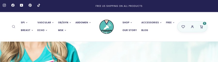
A · Two tidy rows
All thirteen menu items stay visible in two rows that keep the same height at every window size.
View it live Preview store 1Your thoughts
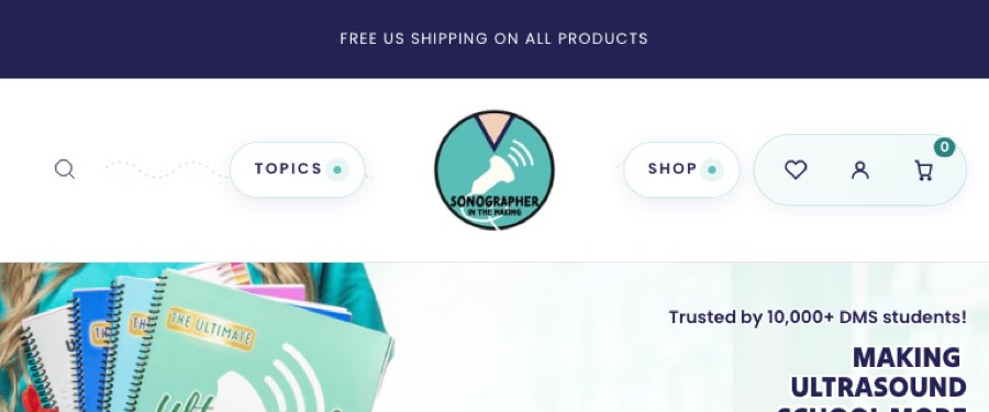
B · One row with panels
The bar stays one slim row. Shop by Topic and Shop by Type open a full-width panel underneath.
View it live Preview store 1Your thoughts
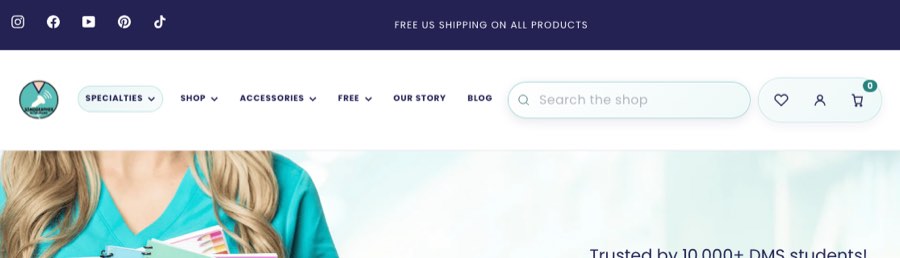
C · Single line
Everything on one line. The seven specialties gather under a single Specialties menu.
View it live Preview store 2Your thoughts
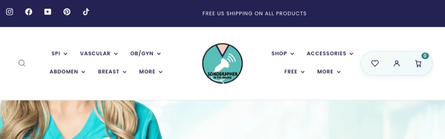
D · Two rows with a More menu
Keeps the two-row look. When space runs short, the last items tuck into a small More menu.
View it live On your own store, as a hidden draft. Sign in to your Shopify admin first and it opens right up.